Showing posts with label Nails Inc Motcomb Street. Show all posts

Monday, 9 November 2015

November Challenges - Blue and Silver

As you can see it is catch up time on the blog again, still wondering if I really should keep this up.
Anyway, the When Colours Collide group have done another collaboration - this time it is Blue and Silver.
I did the mani for this last week and will publish the pic on IG tomorrow as I've already posted too much today!
However, confession time, I did a When Colours Collide collaboration back in August and I completely forgot to blog it so I'll sneak it in on the bottom of this post! That theme was Gifts from Mother Nature and I did butterflies with UberChic 1-02.
For Blue and Silver I am afraid I stayed quite simple. I had just bumped two nails end on onto a cupboard in the kitchen, they were really sore and looked like they were lifting from the nail bed so I was being super cautious with them (hence two rather short looking nails on ring finger and little finger).
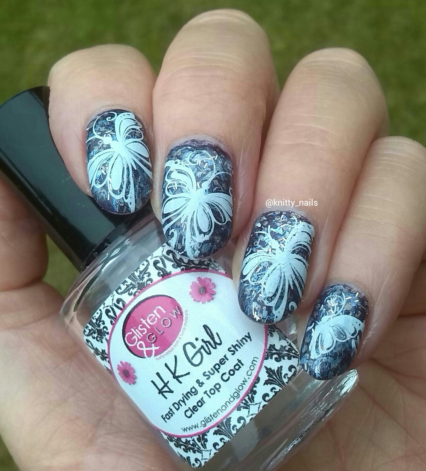
I started with a base of Motcomb Street and then stamped a floral oriental design from Uber Chic Far East 01 (newly arrived from She Sells Seashells) and Nails Inc Soho Silver, a freebie from one of the magazines last year I think.
UberChic Far East 01
 

Blue & Silver

The last one from August / September 2015.
Uber Chic 1-02
Uber Chic 1-02
 Uber Chic 1-02
Gifts from Mother Nature

Wednesday, 5 November 2014

A2Z Series - B is for Bold

Thursday again, so time for the 2nd A2Z challenge. Last weeks was such fun and it was great to see all the Angles manis. The prompt for this week is Bold.
Two things spring to mind when I think of bold. Firstly, where something stands out against its background, like letters or numbers or a pattern and then bold as in brave and courageous.
I decided I'd better do something brave, by my standards at least, and choose a mani that would stand out. On the whole, most of my manis are quite understated and even if I wear a bright, or loud colour, I would wear it as a block rather than with something contrasting.
I've just bought some nail vinyls from She Sells Seashells so I thought this would be a great opportunity to try them out, starting with the straight line stencils as I thought they'd be the easiest. And then, what colours to do? Inspiration struck whilst waiting for my daughter in Jack Wills.
I chose Nails Inc Power Pink as that in itself seems quite a bold choice (the name and the colour) and then the lovely dark Nails Inc Motcomb Street, as I felt that would be a good strong colour to wear against the pink. Power Pink does have a slight blueness to it, probably why I like it so much, so these colours don't really clash, but bold enough I think!
Well, did I say the stripes would be easy? Maybe not! The idea is simple, but I should probably have done a dry run. I never realized how curved my nails are in every direction until I tried to line stripes up so that they would be parallel, and how hard to place them so that the stripes would be equal! I got quicker at putting them on but apparently they work best with 1 coater polish, which makes sense. I'll use a polish that works for stamping next time I think. I did enjoy playing with them, and I will be trying again :)
The result is not quite the perfect image I had in my mind but I am pretty pleased with them and they do look bold !
#A2Znails
A2Z Series - B is for Bold
Nails Inc Power Pink and Nails Inc Motcomb Street
  #A2Znails
 #A2Znails
#A2Znails
#A2Znails

Look HERE to see what everyone else got up to - I can't wait to all the others, and click on the InLinkz too.


Friday, 17 October 2014

Stamping! Nails Inc Motcomb Street over Above the Curve Don't Blink

Today I have used my newest plate, from Moyou London's Explorer Collection, number 22. This is  beautiful plate full of delightful squirly patterns. Since it arrived just after I had painted my nails with  Above the Curve Don't Blink, I spent a day trying to decide what colour would work with the silver holo. I decided I wanted a strong enough colour to stand out, but didn't want to go for black.
In the end I chose Nails Inc Motcomb Street, thinking navy blue would go quite well. As it turned out, one coat of Motcomb Street isn't that dark and it almost has a tealy tone to it that disappears completely when worn as a solid polish. However, I think it worked quite well and I am pleased with the finished mani and the inky tone of the stamping.
I think it's safe to say I am enjoying stamping, made sightly less mess this time and was a bit more successful with picking up the images. Placement is still rather hit and miss but I think it matters less with these patterns; I have yet to try stamping a straight rectangular image onto my nails - expect a few wonky posts!!!
Nails Inc Motcomb Street over  Above the Curve Don't Blink
Nails Inc Motcomb Street over
 Above the Curve Don't Blink
  Nails Inc Motcomb Street over  Above the Curve Don't Blink
  Nails Inc Motcomb Street over  Above the Curve Don't Blink
 Nails Inc Motcomb Street over  Above the Curve Don't Blink
 Nails Inc Motcomb Street over  Above the Curve Don't Blink
 Nails Inc Motcomb Street over  Above the Curve Don't Blink